Containers
Problem
Your UI has problem(s): it’s become overcomplicated, it doesn’t resize well, and/or you can’t keep track of how everything fits together.
Solution
For many developers, building a UI is their least favorite part. It’s very easy for a complex UI to spiral out of control and become impossibly painful to fix or modify. Godot provides some great tools for building UI - and if you take the time to learn to use them, you’ll find that they take away a lot of that pain.
The solution is the Container. Containers provide a lot of power in building your UI’s layout.
When a Control node is added to a Container, the container takes over all the control’s positioning information. You can no longer set the size, position, or other layout properties of the container’s children.
This is the key thing to remember about containers:
A Container node automatically arranges its children. You cannot directly control the position of a child UI node.
Let’s look at some of the most commonly used containers:
CenterContainerThis container places keeps its children centered.
MarginContainerThis container maintains a margin, preventing children from getting too close to the edges of the container. Margin values can be set in the “Custom Constants” section of the properties.
VBoxContainer/HboxContainerThese containers keep their contents aligned vertically or horizontally, respectively. In the “Custom Constants” section you can also set a Separation property to increase spacing between elements.
GridContainerThis container arranges its children in a grid pattern.
Size flags
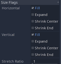
The way a container handles its children is mainly controlled by their “Size Flags” properties.
Fill
When this option is checked, the control fills its assigned location in the container. This option is enabled by default.
Expand
If this option is checked, the control tries to use as much space as it can. Nodes without Expand selected are pushed by those that do.
Shrink Center
When Fill is disabled and Expand is enabled, the control remains at the center of its area, rather than the beginning.
Shrink End
Same as above, except the control stays to the end rather than the beginning.
Stretch Ratio
This ratio sets the amount that expanding controls take up relative to each other.
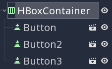
A good way to experiment with these settings is to set up a test scene like the following:
Try adjusting the “Size Flags” properties of the different buttons and see how it affects their positioning in the HBoxContainer.
Nesting Containers
For more complex UI setups, you’ll need to use containers holding other containers. Each item in a GridContainer, for example, may itself be a VBoxContainer, with all of it inside a MarginContainer.
All these containers inside containers can cause your scene tree to become quite large and hard to manage, especially if you have a lot of repeated elements, such as buttons and labels. It’s recommended that you break your UI into pieces and save each part as a separate scene that you can instance in the larger scene.


